Wednesday, April 21, 2010

Star plot


A star plot is a graphical data analysis technique for examining the relative behavior of all variables in a multivariate data set. The star plot consists of a sequence of equi-angular spokes. Each spoke represents a different variable in the multivariate data set. This star plot shows attribute relationships between 5 different designs of a product.

http://upload.wikimedia.org/wikipedia/commons/0/09/MER_Star_Plot.gif

Correlation matrix


A correlation matrix is done to see where there is a correlation among the data. In this matrix, investor funds are correlated to regions, styles of investment, secort, bonds, and the foreign exhange.

Similarity matrix


A similarity matrix is a matrix of scores which express the similarity between two data points. Higher scores are given to more-similar characters, and lower or negative scores for dissimilar characters. This image is of a genetic similarity matrix.

http://www.scielo.cl/fbpe/img/ejb/v10n4/a10/ap2b.jpg

Stem and leaf plot


A stem and leaf plot uses the higher number as the stem and the secondary numbers as the leaf. These plots show the frequency of values. This plot show infant mortality rates in Western Africa.

Box plot


A box plot is a way of mapping data in an easy to interpret form that allows the viewer to easily compare the variables. This map demonstrates stopping distances for three different kinds of motor vehicles. Design C take the longest distance to stop with A & B being comparable. However, B's median stopping distance is lower than A's.

statsoft.com/textbook/popups/popup116.gif

Histogram


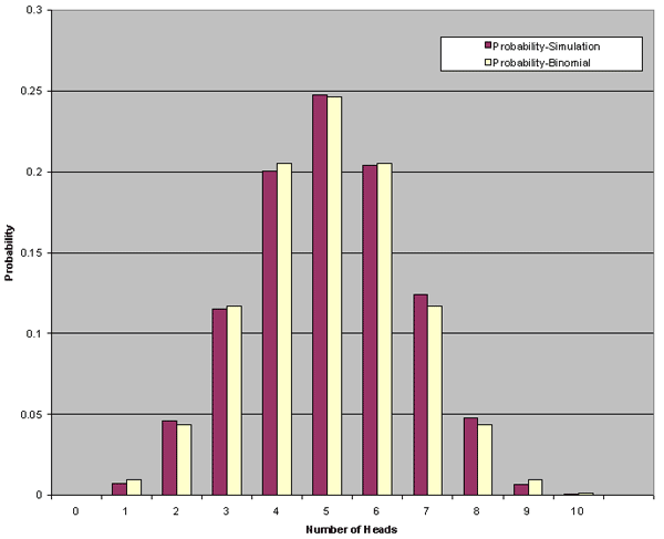
A histogram tablulates frequency. This histogram
shows the results of a study in which the number of times a coin landed on "heads" when flipped ten times.

Parallel coordinate graph


A parallel coordinate graph represents each variable being graphed on a vertical axis; it explores the relationship among the variables.
This graph shows many different baseball statistics, and how they relate to each other.

http://www.matthewtavares.com/baseball_report/

Triangular plot


A triangular plot graphically depicts the ratios of the three variables as positions in an equilateral triangle. In this case the graph depicts the colors red, blue, and yellow and the combinations of the three. In this type if triangular graph each variable has its own axis but the graph remains on a single plane.

Windrose


This image is that of a Windrose. A windrose depicts the direction of the wind along with the speed of the wind in knots. This particular windrose is for Olympia, Washington. The wind is blowing in a primarily southerly to south-westerly direction.

Climograph


This climograph is of the United States over a whole calendar year. A climograph is a graphical depiction of the monthly precipitation and temperature conditions for a selected place. Precipitation is shown by the bar graph. A line graph depicts temperature.

http://wps.prenhall.com/wps/media/objects/214/219557/climograph2_national_ drought%20_mitigation_center.gif

Population profile


Population profiles or population pyramids are commonly used to show the trends in population statistics over time. The first pyramid shows that Kenya has rapid growth. They have a very young population with high fertility rates and high death rates among their older population.

Wednesday, March 17, 2010

Scatterplot


In a scatter plot the data is displayed as a collection of points, each having the value of one variable determining the position on the horizontal axis and the value of the other variable determining the position on the vertical axis. This scatter plot shows the relationship between waiting time between eruptions and eruption duration of Old Faithful.

http://upload.wikimedia.org/wikipedia/commons/0/0f/Oldfaithful3.png

Index value plot


An index value plot is a type of visualization map that is plotted on a line graph.This graph shows relative daily index closings from 1992-2004 for Canada, France, Germany, Japan, the U.K., and the U.S. An index is defined as a statistical indicator/number derived from a formula, which is used to characterize a set of data.

http://www.mathworks.com/products/demos/shipping/garch/garchcopulaevtdemo_01_thumbnail.png

Accumulative line graph or Lorenz curve


The lorenze curve graphically represents the cumulative distribution function of a probability distribution. It is frequently used to display income distribution. It was developed by Max Lorenze in 1905.

http://ingrimayne.com/econ/AllocatingRationing/Figure6.5.gif

Bilateral graph

Bilateral Graphs show and compare the political and cultural relations between two states or countries. This bilateral graph shows the comparisons of opinion with regards to the best leadership of China.

http://media.gallup.com/poll/graphs/080429China2Graph2_GASJIDHUQfredo.gif

Nominal area choropleth map


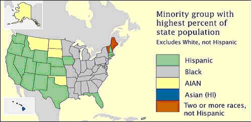
This map shows the different ethnic groups residing in Kenya. Nominal area choropleth maps are used to display categorical data, and no statistical inferences can be drawn from them.

http://www.lib.utexas.edu/maps/africa/kenya_ethnic_1974.jpg

Unstandardized choropleth maps


Unstandardized choropleth maps are unordered maps; there is no specific ranking assigned to the class - one category is not higher or lower than the other.

Standardized choropleth maps


This map shows the percentage of the population aged 14 years and younger in Canada. Standardized choropleth maps are standardized to allow comparison of distribution among differing areas.

http://www.statcan.ca/english/research/92F0138MIE/2008003/figures/figure3.1-en.jpg

Univariate choropleth maps


A univariate choropleth map displays a single data set. Here only one set of data is displayed regarding poverty in the United States.

http://www.cdc.gov/pcd/issues/2007/oct/images/07_0091_02.gif

Bivariate choropleth maps


Bivariate maps display the realtionship of two variables. This map shows the increase from the divorce rate in 1980 to the divorce rate in 1990. It also has a cartographic animation that flashes between the rate in the individual states to a map that also shows the divorce rate by individual counties within each state.