Wednesday, April 21, 2010

Triangular plot


A triangular plot graphically depicts the ratios of the three variables as positions in an equilateral triangle. In this case the graph depicts the colors red, blue, and yellow and the combinations of the three. In this type if triangular graph each variable has its own axis but the graph remains on a single plane.

Windrose


This image is that of a Windrose. A windrose depicts the direction of the wind along with the speed of the wind in knots. This particular windrose is for Olympia, Washington. The wind is blowing in a primarily southerly to south-westerly direction.

Climograph


This climograph is of the United States over a whole calendar year. A climograph is a graphical depiction of the monthly precipitation and temperature conditions for a selected place. Precipitation is shown by the bar graph. A line graph depicts temperature.

http://wps.prenhall.com/wps/media/objects/214/219557/climograph2_national_ drought%20_mitigation_center.gif

Population profile


Population profiles or population pyramids are commonly used to show the trends in population statistics over time. The first pyramid shows that Kenya has rapid growth. They have a very young population with high fertility rates and high death rates among their older population.

Wednesday, March 17, 2010

Scatterplot


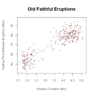
In a scatter plot the data is displayed as a collection of points, each having the value of one variable determining the position on the horizontal axis and the value of the other variable determining the position on the vertical axis. This scatter plot shows the relationship between waiting time between eruptions and eruption duration of Old Faithful.

http://upload.wikimedia.org/wikipedia/commons/0/0f/Oldfaithful3.png

Index value plot


An index value plot is a type of visualization map that is plotted on a line graph.This graph shows relative daily index closings from 1992-2004 for Canada, France, Germany, Japan, the U.K., and the U.S. An index is defined as a statistical indicator/number derived from a formula, which is used to characterize a set of data.

http://www.mathworks.com/products/demos/shipping/garch/garchcopulaevtdemo_01_thumbnail.png

Accumulative line graph or Lorenz curve


The lorenze curve graphically represents the cumulative distribution function of a probability distribution. It is frequently used to display income distribution. It was developed by Max Lorenze in 1905.

http://ingrimayne.com/econ/AllocatingRationing/Figure6.5.gif