Wednesday, March 17, 2010

Scatterplot


In a scatter plot the data is displayed as a collection of points, each having the value of one variable determining the position on the horizontal axis and the value of the other variable determining the position on the vertical axis. This scatter plot shows the relationship between waiting time between eruptions and eruption duration of Old Faithful.

http://upload.wikimedia.org/wikipedia/commons/0/0f/Oldfaithful3.png

Index value plot


An index value plot is a type of visualization map that is plotted on a line graph.This graph shows relative daily index closings from 1992-2004 for Canada, France, Germany, Japan, the U.K., and the U.S. An index is defined as a statistical indicator/number derived from a formula, which is used to characterize a set of data.

http://www.mathworks.com/products/demos/shipping/garch/garchcopulaevtdemo_01_thumbnail.png

Accumulative line graph or Lorenz curve


The lorenze curve graphically represents the cumulative distribution function of a probability distribution. It is frequently used to display income distribution. It was developed by Max Lorenze in 1905.

http://ingrimayne.com/econ/AllocatingRationing/Figure6.5.gif

Bilateral graph

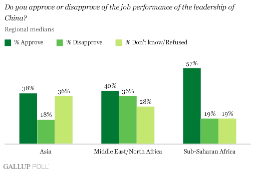
Bilateral Graphs show and compare the political and cultural relations between two states or countries. This bilateral graph shows the comparisons of opinion with regards to the best leadership of China.

http://media.gallup.com/poll/graphs/080429China2Graph2_GASJIDHUQfredo.gif

Nominal area choropleth map


This map shows the different ethnic groups residing in Kenya. Nominal area choropleth maps are used to display categorical data, and no statistical inferences can be drawn from them.

http://www.lib.utexas.edu/maps/africa/kenya_ethnic_1974.jpg

Unstandardized choropleth maps


Unstandardized choropleth maps are unordered maps; there is no specific ranking assigned to the class - one category is not higher or lower than the other.

Standardized choropleth maps


This map shows the percentage of the population aged 14 years and younger in Canada. Standardized choropleth maps are standardized to allow comparison of distribution among differing areas.

http://www.statcan.ca/english/research/92F0138MIE/2008003/figures/figure3.1-en.jpg

Univariate choropleth maps


A univariate choropleth map displays a single data set. Here only one set of data is displayed regarding poverty in the United States.

http://www.cdc.gov/pcd/issues/2007/oct/images/07_0091_02.gif

Bivariate choropleth maps


Bivariate maps display the realtionship of two variables. This map shows the increase from the divorce rate in 1980 to the divorce rate in 1990. It also has a cartographic animation that flashes between the rate in the individual states to a map that also shows the divorce rate by individual counties within each state.

Unclassed choropleth maps


This map shows lightning strike density per square kilometer within the continental United States for the years 1996-2005. An unclassed choropleth is designed to show statistical data in a multi-colored value moving from smallest to largest, using lighter colors to portray smaller values and using progressively darker shades to portray progressively greater values.

Image Source: http://www.weather.gov/os/lightning/images/Vaisala_96-05_Flash_Map.gif

Classed choropleth maps


Classed choropleth maps used different shades of color and tenting to determine different measures of something. This map of North Caroline show how much money is spent per student in the state on public education. The data is done on a county-by-county basis.

http://personal.uncc.edu/lagaro/cwg/color/color_symbol.html

Range graded proportional circle map


This map shows EID events throughout the world. We can see that the majority of them occur in the U.S, and most of the occurrences in the U.S happen in the Northeast. In range graded maps, it is all about symbol size. The data are divided into categories, where the map reader can easily distinguish one class from the other.

http://www.nature.com/nature/journal/v451/n7181/images/nature06536-f2.2.jpg

Continuously variable proportional circle map


This map uses different sized circles to show how much industry is in a certain area. Bigger circles are equivalent to areas with my industry and vice versa. Within each circle, each type of industry that is in that location is represented by different colors. This makes it easy to see which industries dominate which areas.

http://lib.utexas.edu/maps/thematic.html

DOQQ


A Digital Orthophoto Quarter Quadrangle is an aerial photograph that has been geometrically corrected so that the scale of the photograph is uniform. An orthophoto can be used to measure true distances because it is an accurate depiction of the earth's surface. They are most commonly used in the creation of a Geographic Information System. This is a DOQQ of a river in Texas.

DEM


A DEM (Digital Elevation Model) is a digital representation of ground surface topography or terrain. They are built using remote sensing techniques, and can either be raster or TIN format. This DEM is a map of western Australia.
http://www.landmonitor.wa.gov.au/images/products/dem.jpg