Wednesday, April 21, 2010

Star plot


A star plot is a graphical data analysis technique for examining the relative behavior of all variables in a multivariate data set. The star plot consists of a sequence of equi-angular spokes. Each spoke represents a different variable in the multivariate data set. This star plot shows attribute relationships between 5 different designs of a product.

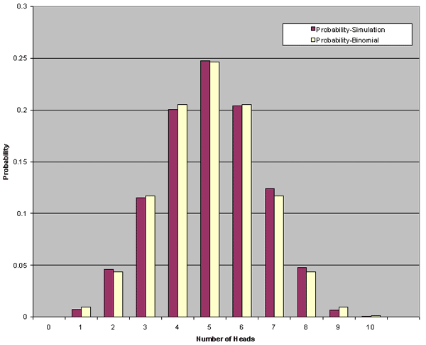
http://upload.wikimedia.org/wikipedia/commons/0/09/MER_Star_Plot.gif

Correlation matrix


A correlation matrix is done to see where there is a correlation among the data. In this matrix, investor funds are correlated to regions, styles of investment, secort, bonds, and the foreign exhange.

Similarity matrix


A similarity matrix is a matrix of scores which express the similarity between two data points. Higher scores are given to more-similar characters, and lower or negative scores for dissimilar characters. This image is of a genetic similarity matrix.

http://www.scielo.cl/fbpe/img/ejb/v10n4/a10/ap2b.jpg

Stem and leaf plot


A stem and leaf plot uses the higher number as the stem and the secondary numbers as the leaf. These plots show the frequency of values. This plot show infant mortality rates in Western Africa.

Box plot


A box plot is a way of mapping data in an easy to interpret form that allows the viewer to easily compare the variables. This map demonstrates stopping distances for three different kinds of motor vehicles. Design C take the longest distance to stop with A & B being comparable. However, B's median stopping distance is lower than A's.

statsoft.com/textbook/popups/popup116.gif

Histogram


A histogram tablulates frequency. This histogram
shows the results of a study in which the number of times a coin landed on "heads" when flipped ten times.

Parallel coordinate graph


A parallel coordinate graph represents each variable being graphed on a vertical axis; it explores the relationship among the variables.
This graph shows many different baseball statistics, and how they relate to each other.

http://www.matthewtavares.com/baseball_report/

Triangular plot


A triangular plot graphically depicts the ratios of the three variables as positions in an equilateral triangle. In this case the graph depicts the colors red, blue, and yellow and the combinations of the three. In this type if triangular graph each variable has its own axis but the graph remains on a single plane.

Windrose


This image is that of a Windrose. A windrose depicts the direction of the wind along with the speed of the wind in knots. This particular windrose is for Olympia, Washington. The wind is blowing in a primarily southerly to south-westerly direction.

Climograph


This climograph is of the United States over a whole calendar year. A climograph is a graphical depiction of the monthly precipitation and temperature conditions for a selected place. Precipitation is shown by the bar graph. A line graph depicts temperature.

http://wps.prenhall.com/wps/media/objects/214/219557/climograph2_national_ drought%20_mitigation_center.gif

Population profile


Population profiles or population pyramids are commonly used to show the trends in population statistics over time. The first pyramid shows that Kenya has rapid growth. They have a very young population with high fertility rates and high death rates among their older population.

Wednesday, March 17, 2010

Scatterplot


In a scatter plot the data is displayed as a collection of points, each having the value of one variable determining the position on the horizontal axis and the value of the other variable determining the position on the vertical axis. This scatter plot shows the relationship between waiting time between eruptions and eruption duration of Old Faithful.

http://upload.wikimedia.org/wikipedia/commons/0/0f/Oldfaithful3.png

Index value plot


An index value plot is a type of visualization map that is plotted on a line graph.This graph shows relative daily index closings from 1992-2004 for Canada, France, Germany, Japan, the U.K., and the U.S. An index is defined as a statistical indicator/number derived from a formula, which is used to characterize a set of data.

http://www.mathworks.com/products/demos/shipping/garch/garchcopulaevtdemo_01_thumbnail.png

Accumulative line graph or Lorenz curve


The lorenze curve graphically represents the cumulative distribution function of a probability distribution. It is frequently used to display income distribution. It was developed by Max Lorenze in 1905.

http://ingrimayne.com/econ/AllocatingRationing/Figure6.5.gif

Bilateral graph

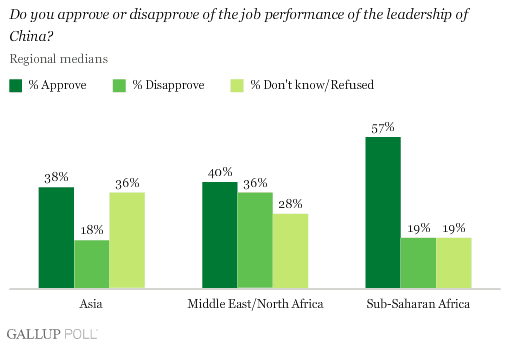
Bilateral Graphs show and compare the political and cultural relations between two states or countries. This bilateral graph shows the comparisons of opinion with regards to the best leadership of China.

http://media.gallup.com/poll/graphs/080429China2Graph2_GASJIDHUQfredo.gif

Nominal area choropleth map


This map shows the different ethnic groups residing in Kenya. Nominal area choropleth maps are used to display categorical data, and no statistical inferences can be drawn from them.

http://www.lib.utexas.edu/maps/africa/kenya_ethnic_1974.jpg

Unstandardized choropleth maps


Unstandardized choropleth maps are unordered maps; there is no specific ranking assigned to the class - one category is not higher or lower than the other.

Standardized choropleth maps


This map shows the percentage of the population aged 14 years and younger in Canada. Standardized choropleth maps are standardized to allow comparison of distribution among differing areas.

http://www.statcan.ca/english/research/92F0138MIE/2008003/figures/figure3.1-en.jpg

Univariate choropleth maps


A univariate choropleth map displays a single data set. Here only one set of data is displayed regarding poverty in the United States.

http://www.cdc.gov/pcd/issues/2007/oct/images/07_0091_02.gif

Bivariate choropleth maps


Bivariate maps display the realtionship of two variables. This map shows the increase from the divorce rate in 1980 to the divorce rate in 1990. It also has a cartographic animation that flashes between the rate in the individual states to a map that also shows the divorce rate by individual counties within each state.

Unclassed choropleth maps


This map shows lightning strike density per square kilometer within the continental United States for the years 1996-2005. An unclassed choropleth is designed to show statistical data in a multi-colored value moving from smallest to largest, using lighter colors to portray smaller values and using progressively darker shades to portray progressively greater values.

Image Source: http://www.weather.gov/os/lightning/images/Vaisala_96-05_Flash_Map.gif

Classed choropleth maps


Classed choropleth maps used different shades of color and tenting to determine different measures of something. This map of North Caroline show how much money is spent per student in the state on public education. The data is done on a county-by-county basis.

http://personal.uncc.edu/lagaro/cwg/color/color_symbol.html

Range graded proportional circle map


This map shows EID events throughout the world. We can see that the majority of them occur in the U.S, and most of the occurrences in the U.S happen in the Northeast. In range graded maps, it is all about symbol size. The data are divided into categories, where the map reader can easily distinguish one class from the other.

http://www.nature.com/nature/journal/v451/n7181/images/nature06536-f2.2.jpg

Continuously variable proportional circle map


This map uses different sized circles to show how much industry is in a certain area. Bigger circles are equivalent to areas with my industry and vice versa. Within each circle, each type of industry that is in that location is represented by different colors. This makes it easy to see which industries dominate which areas.

http://lib.utexas.edu/maps/thematic.html

DOQQ


A Digital Orthophoto Quarter Quadrangle is an aerial photograph that has been geometrically corrected so that the scale of the photograph is uniform. An orthophoto can be used to measure true distances because it is an accurate depiction of the earth's surface. They are most commonly used in the creation of a Geographic Information System. This is a DOQQ of a river in Texas.

DEM


A DEM (Digital Elevation Model) is a digital representation of ground surface topography or terrain. They are built using remote sensing techniques, and can either be raster or TIN format. This DEM is a map of western Australia.
http://www.landmonitor.wa.gov.au/images/products/dem.jpg

Sunday, February 14, 2010

DLG


Topographic maps of the USGS are well known to hikers and others. The USGS has digitized many of these maps and published them on the Web as Digital Line Graph (DLG) files in vector form. This particular DLG is of the San Francisco North Quadrangle.

DRG


A digital raster graphic (DRG) is a scanned image of a U.S. Geological Survey (USGS) standard series topographic map, including all map collar information. The image inside the map neatline is georeferenced to the surface of the earth and fit to the Universal Transverse Mercator projection. This DRG is a map of a section of Michigan.

Wednesday, February 3, 2010

Isopleths


An isopleth map simplifies data that is continuously distributed. It shows the data being displayed as a third dimension on the map. This map measure acid rainfall in the United States by looking at the pH level of rain in different areas.

http://dwb4.unl.edu/Chem/CHEM869V/CHEM869VLinks/weather.about.com/newsissues/weather/library/weekly/aa071600a.htm

Isopach


An isopach map connects points of equal thickness in a given area. Isopach maps are used in structural geology, sedimentology, and volcanology. This map in particular shows the distribution of barnett shale in the western United States.

http://www.republicenergy.com/Articles/Barnett_Shale/Isopach_Barnett_Shale.jpg

Isohyets


An isohyet is a line joining points of equal precipitation on a map. A map with isohyets is called an isohyetal map. This is a isohyet map of Borneo.

http://www.forest.sabah.gov.my/caims/Climatic%20information/Stations/Maps/Isohyet/isohyet.gif

Isotachs


An isotach is a line on a weather map or chart connecting points where equal wind velocities have been recorded. This map is of the Foothills and is an excellent depiction of isotachs.

Isobars


Isobars are lines of equal pressure, and joins points which share that share values. This isobar map in particular, shows sea level pressure for a given study area for the UK and Ireland.

http://www.weatheronline.co.nz/reports/wxfacts/isobars1.gif

Tuesday, January 26, 2010

LIDAR


LIDAR stands for light detection and ranging. Lidar imaging is a form of remote sensing that maps topographic data. This lidar image is of lower Manhattan in New York City.

Doppler Radar


A Doppler radar uses sound waves to visually depict weather patterns. Weather forecasters use this technology to predict weather. This is a Doppler radar image of central Florida during a hurricane.
http://www.weatherusa.net/blog/images/doppler-orlando-1943.gif

Black and White Aerial Photo


Black and white aerial photographs can be very beneficial in showing landforms, vegetation, and resources. They make landscape features more easily understood on a regional, continental, and even global scale. This photograph shows a neighborhood and major highway.

Infrared Aerial Photo


Geographers use a camera to capture a certain band of light called infrared. These images can be used specifically to document changes in the environment and the health of forests, wetlands, bays and oceans. This image shows water near land plots.

Cartographic Animations


A cartographic animation is a map that has moving aspects which show us what could happen under certain circumstances. In this case, the animation shows the development and movement of Hurricane Katrina.

Statistical Map


Statistical maps are based upon numerical values and gives a standard statistic with regards to a specific period of time. The given map depicts statistical changes in burglaries in the Denver, Colorado area.

Cartogram


Cartogram maps scale the area of each country in proportion to its population. The shape and relative location of each country is retained to as large an extent as possible, but a large amount of distortion tends to always exist. This map shows the amount electoral votes each state got by the number of squares that make up the state.

Flow Map


A flow map shows the movement of objects from one place to another. This flow map shows total combined truck flows for Texas.

http://www.lib.utexas.edu/maps/ texas/combtrk_tx_1998.jpg

Isoline Maps


Isoline maps are a two dimensional representation of a three dimensional model. An isoline map give you a picture of the concentration of people.

Proportional Circle Map


Proportional circle maps display data in relation to the size of the circles. In this map data is displayed of internet users in Europe.
http://jeffhobbs.files.wordpress.com/2008/03/1.gif

Tuesday, January 12, 2010

Choropleth Map


A Choropleth map is a thematic map in which areas are shaded or patterned in proportion to the measurement of the statistical variable being displayed on the map. This map shown shows the divorce rate increase in each state based on color.

Dot Distribution Map


Dot distribution maps are used to show the presence of a feature or occurrence and display a spatial pattern. The map shown here shows the size of populations of cities in the United States based on dot distribution.

Propaganda Map

A Propaganda map is created to express a biased opinion and convince others of it, usually exaggerating specific features. This map in particular is a political satire showing President Reagan's view of the world.

http://strangemaps.files.wordpress.com/2006/11/800px-reagan-digitised-poster.JPG?w=474&h=362

Hypsometric Map

A Hypsometric map, also known as a relief map, is a map depicting the configuration of the earth’s surface, called the “relief,” by means of contours, form lines, hachures, shading, tinting, or relief models. The specific map is a topographic hypsometric map of the Goiania Metropolitan Region.

http://www.earthexplorer.com/2009-03/images/Figure-3---Topographic-hypsometric-map-of-Goiania-Metropolitan-Region_big..jpg

PLSS Map

PLSS stands for Public Land Survey System. These maps are used as a way of subdividing describing land in the United States. This map in particular is a section of Minnesota divided into sections by townships and ranges.

fairview-industries.com/standardmodule.mn-exmp2.gif

Monday, January 11, 2010

Cadastral Map


A Cadastral map shows the boundaries and ownership of land parcels. In this particular map, colors depict they type of land usage.

http://www.dgs-gis.cz/images/bigones/katastralni.jpg

Thematic Map

Thematic maps show geographic patterns in statistical data, such as population or median income, displayed as color-coded areas on a map. The map shown here is a thematic map showing the population percent change of the United States between 1990 and 1996.

http://www.sou.edu/Geography/JONES/GEOG280/stpop96.GIF